Creating Ongoing Customer Engagement
A UX design aimed at helping users organize the home remodel process and simplify decision making
A UX design aimed at helping users organize the home remodel process and simplify decisions


Primary Role
UX Architect
Industry
b2c - eCommerce
b2c - eCommerce
Business Problem
Signature Hardware is a premium home fixtures brand. They have physical locations and an online eCommerce site. The client was migrating to a new platform and saw this as an opportunity to rethink the user experience.
The home improvement and fixtures industry is valued at over $2.5 billion. Signature Hardware wanted to prioritize return visitors and maximize profits.
Outcome
We improved shopping for 40% of e-commerce shoppers who preferred a Favorites experience for their purchase decisions. This led to more return visitors as well as reduced cart abandonment and bounce rates.
We improved shopping for 40% of e-commerce shoppers who preferred a Favorites experience for their purchase decisions. This led to more return visitors as well as reduced cart abandonment and bounce rates.
Final Designs


The Customer Problem
Customers are so overwhelmed with making decisions when renovating their homes that they often don't finish the process.
Customers are so overwhelmed with making decisions when renovating their homes that they often don't finish the process.
Defining the User
We interviewed key stakeholders and store associates to understand challenges they faced when assisting customers. The conversations provided insight into common problems, decision-making, and shopping behaviors, ultimately shaping our primary persona: Homeowners.
We interviewed key stakeholders and store associates to understand challenges they faced when assisting customers. The conversations provided insight into common problems, decision-making, and shopping behaviors, ultimately shaping our primary persona: Homeowners.
"My mom has one opinion. My sister has another. I watch HGTV and look at all these mood boards. This has been put on the back burner so many times because it's expensive to mess up.
-Home owner
"People are jumping to so many sites for inspiration on a tub that looks exactly the same. They're building their vision using other sources when we can handle most of it."
-Stakeholder
"I provide so many recommendations in a day. People have different styles and are often negotiating with their spouse."
-Store Associate
"A person can have one style, or many styles, and there are so many ways to visualize that for people. It's tough."
-Store Associate
The Primary Persona
The primary users were homeowners. They had loose timelines and had the least amount of experience. This was found to be the primary influence on the long home remodel process.
The primary users were homeowners. They had loose timelines and had the least amount of experience. This was found to be the primary influence on the long home remodel process.

Home Owner
Motivations
Defining their style
Balancing premium vs affordable
Online convenience and expert advice
Defining their style
Balancing premium vs affordable
Online convenience and expert advice
Frustrations
Large and expensive returns or exchanges
Doubts regarding quality and service
Decision overload
Visualizing options
Large and expensive returns or exchanges
Doubts regarding quality and service
Decision overload
Visualizing options
'They find something once and think it's the same thing when they come back and that isn't always the case'
-Store Associate
'Customers spend a lot of time comparing things. They could have two different ideas of what their bathroom should look like'
-Store Associate
'People are on a schedule sometimes. When they order the wrong thing it is really frustrating to fix.'
-Stakeholder
Identifying Pain Points
The main finding we uncovered with a Customer Journey was users utilizing carts to save items for later. Customers were using one cart to build out different looks for different rooms all at once. This led to high cart abandonment rates.
The main finding we uncovered with a Customer Journey was users utilizing carts to save items for later. Customers were using one cart to build out different looks for different rooms all at once. This led to high cart abandonment rates.
Awareness
The customer discovers the brand
Pain Points
Competing with other brands on outlets like blogs and television to stand out
Consideration
The customer is browsing the site
Pain Points
High bounce rates
Comparing products
Acquisition
The checkout process begins
Pain Points
High cart and checkout abandonment
Service
Post purchase interactions with the business
Pain Points
Low account creation
Returns and exchanges
Loyalty
Deciding whether to remain a customer or not
Pain Points
Return customers
Awareness
The customer discovers the brand
Issue
Competing with other brands on outlets like blogs and television to stand out
Consideration
The customer is browsing the site
Pain Points
- High bounce rates - Comparing products - Return visitors
Acquisition
The checkout process begins
Issue
High cart and checkout abandonment
Service
Post purchase interactions with the business
Issue
Low account creation Returns and exchanges
Loyaltyy
Deciding whether to remain a customer or not
Pain Points
Return customers
The Solution
We introduced a Favorites List to reduce cart abandonment, enhance organization, and improve decision-making. This feature encouraged return users and increased account creation.
We introduced a Favorites List to reduce cart abandonment, enhance organization, and improve decision-making. This feature encouraged return users and increased account creation.
Objective
Make it easy to find
Make it easy to personalize
Make it easy to organize
Goals
Increase return visitors
Lower cart abandonment
Increase account creation
Design Process
The feature was not an out-of-the-box feature on Salesforce Commerce Cloud. This allowed us to build a custom experience.
We benchmarked brands like Etsy and Home Depot. The experiences were decided after analyzing blogs that customers entered the Signature site from the most.
The feature was not an out-of-the-box feature on Salesforce Commerce Cloud. This allowed us to build a custom experience.
We benchmarked brands like Etsy and Home Depot. The experiences were decided after analyzing blogs that customers entered the Signature site from the most.
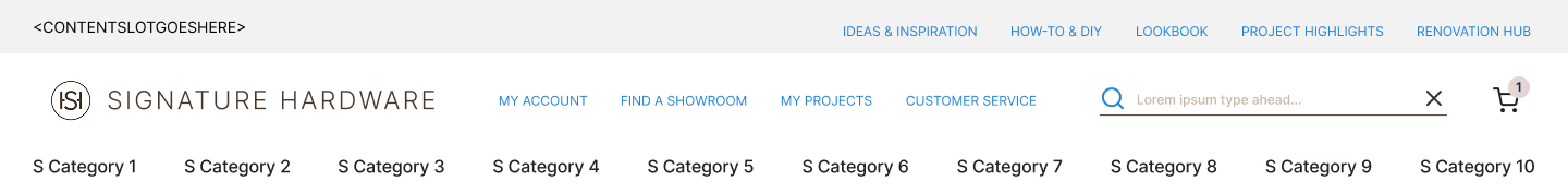
Awareness
Global Navigation

Version 1
Benchmarking revealed the clipboard icon was an uncommon choice for Favorites, making it less recognizable.
User feedback also felt the design was cluttered.
Benchmarking revealed the clipboard icon was an uncommon choice for Favorites, making it less recognizable.
User feedback also felt the design was cluttered.

Version 2
We replaced icons with links for better Account visibility. User testing revealed ‘My Projects’ didn’t align with the Heart icon on mobile.
We replaced icons with links for better Account visibility. User testing revealed ‘My Projects’ didn’t align with the Heart icon on mobile.


Version 3
The third version felt better, The client expressed interest in more robust search integrations.
We worried later designs could jeopardize visibility of Favorites.
The third version felt better, The client expressed interest in more robust search integrations.
We worried later designs could jeopardize visibility of Favorites.


Final
We future proofed the design by moving the Search feature further away.
We dropped the Search below the header to not cover Favorites when a user searched for products.
We future proofed the design by moving the Search feature further away.
We dropped the Search below the header to not cover Favorites when a user searched for products.
Consideration
Product Listing Page

We added a Heart icon to Product Tiles for consistency with Favorites in the Header.
A hover state improved visibility, making the feature easier to find based on quick user testing.
We placed the feature on all product tiles to introduce the feature early in the experience. This was meant to lower cart abandonment later in the flow.
Compromise
We excluded Favorites from mobile Product Listing Pages for the MVP due to development constraints, with plans to address it in future iterations.
We excluded Favorites from mobile Product Listing Pages for the MVP due to development constraints, with plans to address it in future iterations.
Consideration
Product Details Page


Version 1
The Favorites feature was initially placed at the top of the page near the Product Name. We felt this would make it visible.
The Favorites feature was initially placed at the top of the page near the Product Name. We felt this would make it visible.


Final
We later moved Favorites next to Add to Cart. This change, made in the high-fidelity design phase, aimed to prevent the cart from being used as a wishlist while keeping Favorites prominent.
We later moved Favorites next to Add to Cart. This change, made in the high-fidelity design phase, aimed to prevent the cart from being used as a wishlist while keeping Favorites prominent.
Consideration
Add to List

To make personalization intuitive, we placed the Add to List feature on all Product Tiles, Details Pages, and Cart.
For better organization, users could create multiple lists, view them simultaneously, and customize names for easy management.
Acquisition
Cart


We added the Favorites feature to the cart page to reduce bounce rates by giving users an alternative to abandoning items.
Since users spent the most time editing their carts due to cost considerations, this feature allowed them to save items for later, improving retention and purchase intent.
Service & Loyalty
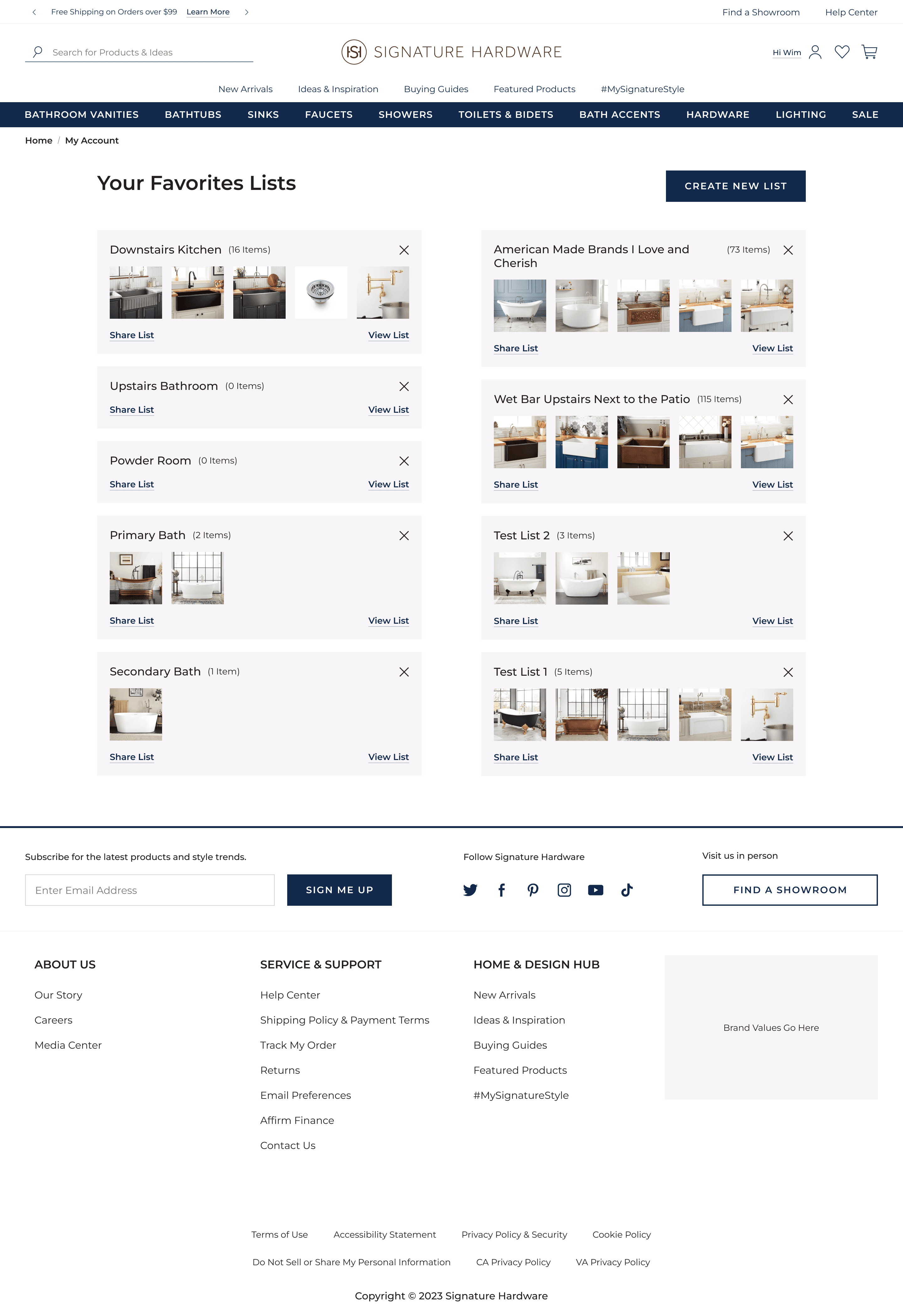
Account Dashboard

We integrated the Favorites feature into Salesforce Commerce Cloud’s account design, prioritizing the Most Recently Created List for easy discovery and organization. This approach prevented confusion from duplicate list names and accidental additions to older lists.
Compromise
The team proposed unlimited lists, while the client preferred a limit of three. Since users created multiple lists per room based on sales conversations, we compromised at six for better organization.
The team proposed unlimited lists, while the client preferred a limit of three. Since users created multiple lists per room based on sales conversations, we compromised at six for better organization.
Service & Loyalty
Favorites Lists
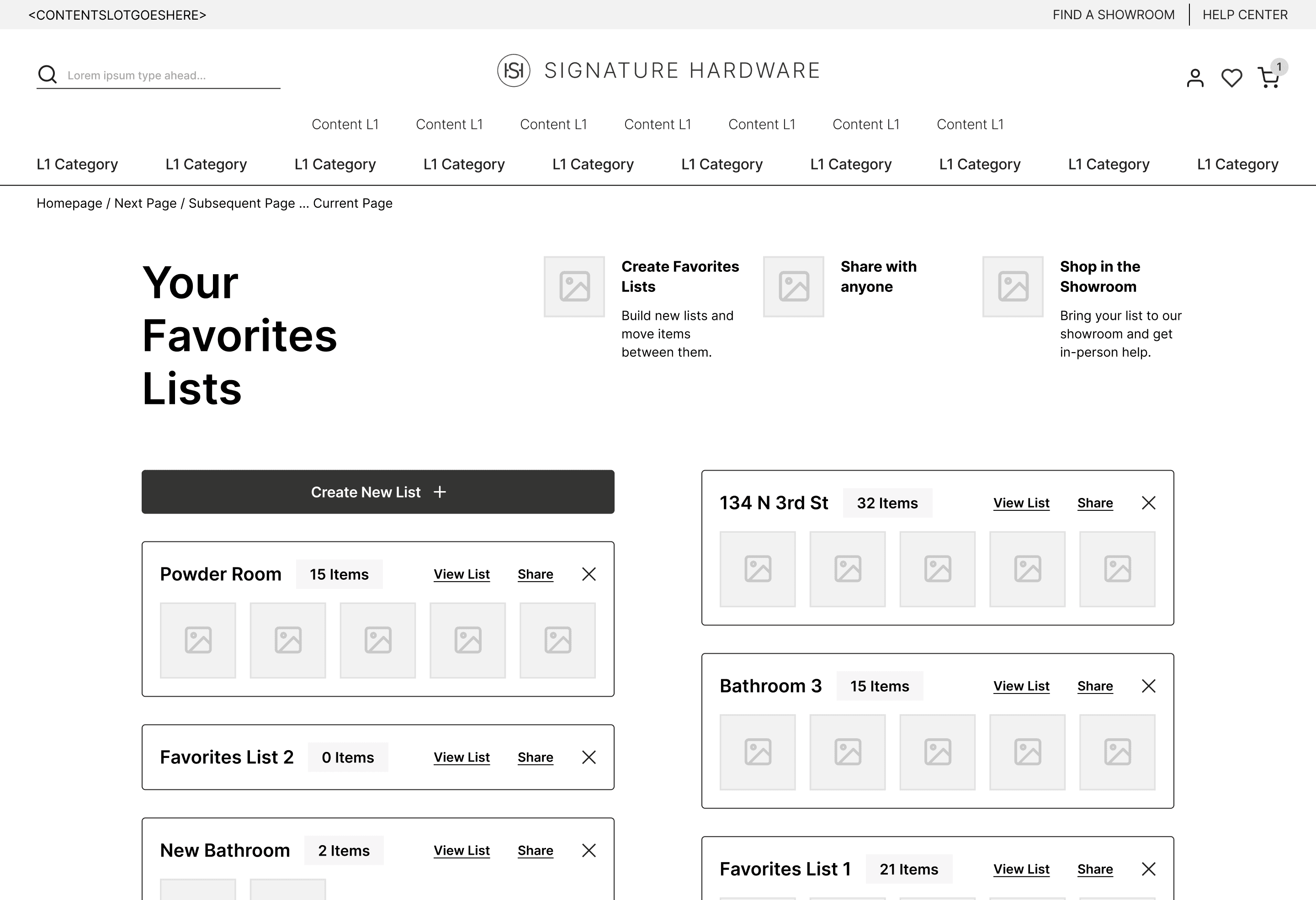
Compromise
I initially designed the Favorites feature for all users to reduce cart abandonment and boost return visits. Promotional content was included for new users. The business prioritized account creation instead and the content was removed.
I initially designed the Favorites feature for all users to reduce cart abandonment and boost return visits. Promotional content was included for new users. The business prioritized account creation instead and the content was removed.
Favorites lists featured product images for easy identification and sharing options for curated feedback and customization.
Service & Loyalty
Favorites Details
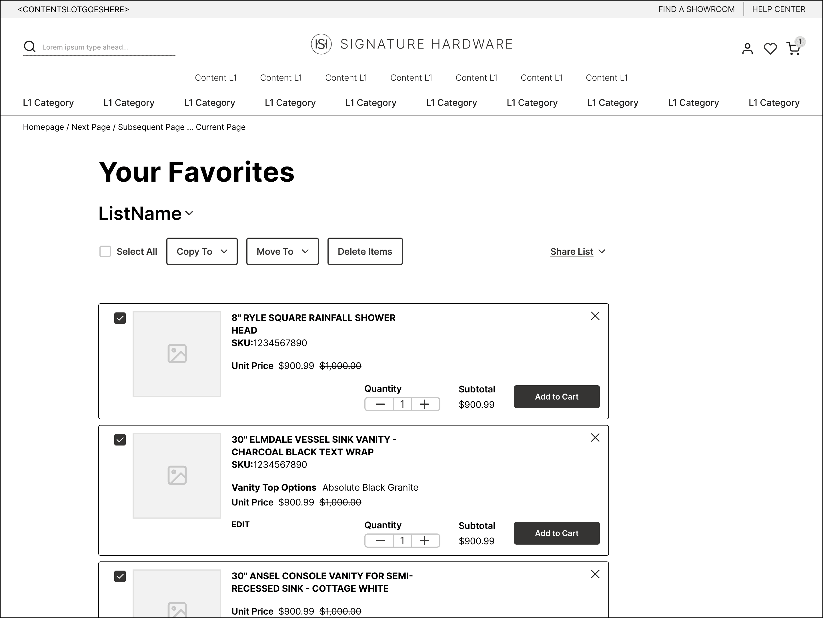
The Favorites List Details prioritized customization and organization. Users could edit item details (quantity, size, color), copy, move, or delete items. A share feature helped with decision-making, and every item could be added directly to the cart for easy checkout.
More Projects
New Product Launch Strategy
With user-centered approach, the goals was to create an intuitive interface for effortless financial management while incorporating gamification.
Coming Soon
Optimizing Healthcare Access
With user-centered approach, the goals was to create an intuitive interface for effortless financial management while incorporating gamification.
Coming Soon